Rose Landing Page


Rose is a mental health startup that offers a platform connecting patients and providers for early detection of depression and mood disorders. Rose's mission is to transform the mental health industry and increase the efficiency of provider-patient engagement. Here’s how I designed a landing page to help Rose communicate its value.


rose_clay_mockup.png

Overview

GOAL

Work within a design system to help Rose design a high-fidelity landing page that is informative, purpose-driven, and drives conversions.

TOOLS
Adobe XD, Miro

DURATION
1 week | August 2020

ROLE
Visual Designer (Solo Project)

DELIVERABLE
High-fidelity landing page


PROCESS

Rose+%286%29.jpg
 

Discovery & Research

BUSINESS ANALYSIS

Determining Rose’s target audience

I began by researching Rose using its existing website and various articles it was featured in, with the goal of determining Rose’s target audience.

At first, it was unclear whether Rose was trying to cater to providers, patients, or both. While the website seemed to focus on providers, articles implied that patients are the primary customers.

rose_oldsite.png

After conducting a business analysis, I learned that while Rose’s platform is meant for use by both providers and patients, it currently only reaches patients via provider referrals. Thus, the landing page should target mental health providers.

Rose+%281%29.jpg
heuristics.JPG


HEURISTIC EVALUATION

Assessing the current website

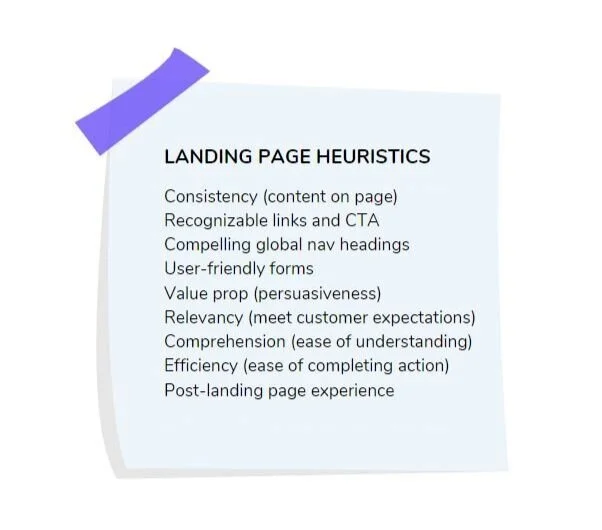
I then researched landing page best practices and conducted a heuristic evaluation to use as a starting point for my landing page design.

COMPETITIVE ANALYSIS

How are similar companies designing their landing pages?

I also used the landing page heuristics to evaluate a few landing pages of similar companies, such as Blueprint, Talkspace, and Ginger to see how Rose’s competitors compared to Rose. I made a feature inventory table to help me visualize where Rose was exceling and lacking compared to its competitors.

rosecompetitors.JPG
Rose+%288%29.jpg

Define

PROTO-PERSONAS

Empathizing with healthcare providers

Because of the limited timeline of this project, I did not conduct user interviews, however, I created hypothesized proto-personas to help me empathize with Rose’s target audiences. While I intended for the landing page audience to be providers only, I created a patient persona as well.

Note: In the future, I would conduct interviews to validate or invalidate my hypotheses about these audiences.

Making these personas was extremely helpful in determining the visual style and content for the landing page.

Rose (5).png

BRAND WORKSHOP

Rose is contemporary, secure, and intelligent

I also participated in a branding workshop to try defining Rose’s brand in different ways. Through this workshop, I came up with a brand statement, personality, affinity, and voice for Rose. This helped me to get a better feel for the overall vibe and communication style of my landing page.

Rose (4).png
 

VISUAL DESIGN DECISIONS

Visual design for trust, security, modernity, and approachability

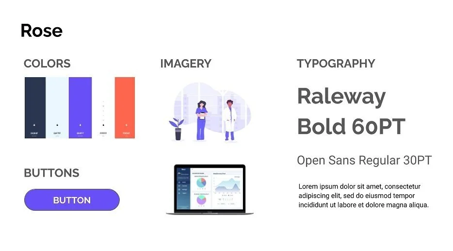
I decided to keep many of the visual elements from Rose’s existing website because it was effective in conveying a sense of trust and security, but also modernity and approachability.

For typography, I chose to apply a combination of Raleway (which Rose was already using) and Roboto, two sans-serif typefaces for friendliness and a tech-savvy vibe.

Ideate

CONTENT

An unexpected challenge

One of the toughest parts of this project was deciding on the content to include on the landing page. There was so much information scattered around Rose’s existing website, that it was difficult to know what was most important to communicate.

I came up with a general outline and some key information to include on the page (e.g. emphasize artificial intelligence, “How It Works” section, platform features), but left most of the decision-making for later.


SKETCHES

Quick sketches for rapid ideation

I then sketched out various layouts and concepts for Rose’s landing page. Here are a few of my sketches.

p4_sketches.png

Prototype & Test

WIREFRAME & ITERATIONS

Adding fidelity to the design

I built a wireframe in Adobe XD based on my sketches, then created an initial landing page design and received feedback from 17 people about what was and wasn’t effective about it. Here are is an evolution from wireframe to final landing page.

p4-wireframe-evolution.png

Final Design

Here is the final landing page design:

Rose+%281%29.jpg

CONCLUSION

Next Steps

There’s still room for growth in this landing page design. Moving forward, I would:

  1. Test the design on mental health providers for their feedback, and make adjustments as needed.

  2. Add social proof (once available) in the form of reviews of the platform to increase credibility.


Final Thoughts

Although artificial intelligence in mental healthcare may strike skepticism in some, it’s almost inevitable in this increasingly digital world. It’s important to take the steps to build trust in these technologies, and that might start with a simple landing page - the first impression of a product. I’m grateful to have contributed to Rose’s mission to make mental healthcare more accessible and am excited to see where the company goes.